For 2026, the strongest wedding palettes pair saturated accent colours, think cobalt, emerald, terracotta or magenta, with a flexible neutral base like Pantone's Cloud Dancer. Choose a palette that already suits your venue, season and the way your photographer works with light, rather than picking colours in isolation. Once you find a combination you love below, test real swatches before committing to it.
TL;DR:
- Match colors to the season: spring suits soft florals, summer favors bright tones, fall supports jewel hues, and winter offers warm neutrals or navy.
- Build around fixed venue colors, then use the 60-30-10 rule: dominant linens take 60%, florals and attire 30%, and accents 10%.
- Test fabric, stationery, and floral samples at the venue during the actual photo hour; warm lighting can yellow whites or mute jewel tones.
- Choose champagne, bronze, or rose gold over bright gold or silver when flash photography is expected, since reflective finishes can cause glare.
- Treat cultural color traditions as fixed requirements and build neutral shades, metallics, and accents around them rather than forcing a trend palette afterward.
Table of Contents
- 1. Top 12 trending 2026 wedding colour palettes
- 2. Which palettes work best in spring, summer, fall and winter
- 3. How to choose a palette that won't fight your venue, photographer or florals
- 4. Palette examples mapped to wedding styles
- 5. Checklist for testing swatches, proofs and florals before you commit
- 6. Using colour-matched small-batch favours to reinforce your palette
- 7. Palette combinations for cultural and regional wedding traditions
- 8. London's Sweets: a colour-matching favour option
- FAQ
- Sources
1. Top 12 trending 2026 wedding colour palettes
Colour direction this year has moved away from the soft, play-it-safe neutrals that dominated recent seasons. Wedding colour trends for 2026 are pivoting toward bold, saturated hues such as cobalt blue, emerald, terracotta and electric magenta, often set against modern neutrals for contrast. At the same time, Pantone's Cloud Dancer gives couples an airy off-white base that works with both pastels and punchier accent colours, so you don't have to choose between a quiet palette and a bold one. These twelve combinations represent the range couples are actually building weddings around this year.
- Mocha Mousse + Champagne + Warm Ivory. A warm, neutral-forward trio that reads as understated and expensive rather than plain; it fits winter weddings and couples who want their palette to photograph well for decades, not just one season, and works particularly well in ballroom or indoor venues with warm lighting.
- Dusty Sage + Ivory + Champagne. Soft and botanical, this combination leans into greenery-heavy florals and suits garden or barn venues; keep linens in ivory and let sage show up in bridesmaid attire and ribbon details.
- Dusty Mauve + Blush + Rose Gold. A romantic, low-contrast palette that flatters most skin tones in photos; rose gold flatware and signage ties the look together without feeling dated.
- Midnight Navy + Gold + Ivory. Formal and dramatic, this pairing suits evening receptions and black-tie weddings; gold accents read richer under candlelight than daylight, so plan florals and linens with your reception lighting in mind.
- Terracotta + Rust + Cream. A warm, earthy palette tied closely to the new rustic aesthetic; it photographs beautifully outdoors in late afternoon sun and pairs naturally with dried grasses and wood details.
- Forest Green + Deep Ivory + Copper. A grounded, moody combination that suits woodland or vineyard venues; copper accents on menus and signage add warmth without competing with the green.
- Dusty Blue + Soft White + Silver. A cooler, breezier option for coastal or spring venues; silver reads cleanest in daylight, so this palette is best saved for ceremonies and receptions with natural light.
- Butter Yellow + Soft Blush + Sage. Cheerful without being saccharine, this trio works well for spring and early summer weddings and pairs easily with mixed wildflower arrangements.
- Deep Plum + Burgundy + Rose Gold. A jewel-tone palette built for fall, especially around candlelit or indoor evening receptions where the depth of colour really shows.
- Soft Lavender + Lilac + Pale Gold. Light and romantic, this combination suits spring garden weddings and photographs softly without washing out in daylight.
- Warm Charcoal + Ivory + Black. A modern, graphic palette for couples who want a city or industrial-venue aesthetic; keep the ratio heavy on ivory so the look doesn't skew funereal.
- Coral + Peach + Champagne. Bright and sun-friendly, this palette is built for summer weddings and outdoor cocktail hours, where the warmth of the colours matches the season.
Save two or three favourites from this list before moving on. The next step is matching one to the season and light you'll actually be working with.
2. Which palettes work best in spring, summer, fall and winter
The season you're marrying in should narrow your palette choices as much as your personal style does. Flower availability, natural light and even how guests dress all shift with the calendar, and a palette that looks perfect on a mood board can fall flat if it fights the season.
- Spring: Lighter, softer palettes like Butter Yellow + Soft Blush + Sage or Dusty Sage + Ivory + Champagne make the most of peak flower availability and the clear, diffused light typical of spring days.
- Summer: Vibrant, sun-friendly combinations such as Coral + Peach + Champagne or Dusty Blue + Soft White + Silver hold up well against bright outdoor light; heavier, dark palettes tend to look flat or even muddy under direct summer sun.
- Fall: Jewel tones and warm neutrals, Deep Plum + Burgundy + Rose Gold, Terracotta + Rust + Cream, or Forest Green + Deep Ivory + Copper, read especially well by candlelight and against autumn foliage, since the natural backdrop is already doing some of the work.
- Winter: Choose between two directions: a warm, minimalist neutral palette like Mocha Mousse + Champagne + Warm Ivory for an understated look, or a formal, maximalist palette like Midnight Navy + Gold + Ivory for a dressier evening feel.
Neither direction is objectively better for winter weddings; it comes down to whether your venue and guest list lean toward quiet elegance or formal drama. The same logic applies across all four seasons: let the natural light and available florals guide which palette from your shortlist actually gets built out.
3. How to choose a palette that won't fight your venue, photographer or florals
A palette that looks perfect on a screen can clash the moment it meets your actual venue. The fix is to treat your venue's fixed colours, not your Pinterest board, as the real starting point.
- Start with what you can't change. Note the carpet colour, wall panelling, chair upholstery and any fixed drapery at your venue, then build your palette to complement those tones rather than clash with them; this alone prevents the single most common decor mismatch.
- Apply the 60-30-10 rule. The 60-30-10 colour rule distributes colour so no single tone overwhelms the room: 60% is your dominant tone, typically linens and large-format decor; 30% goes to florals and attire, like bridesmaid dresses or a groomsman's tie; and the remaining 10% is reserved for accents such as menu cards, ribbon or candle holders.
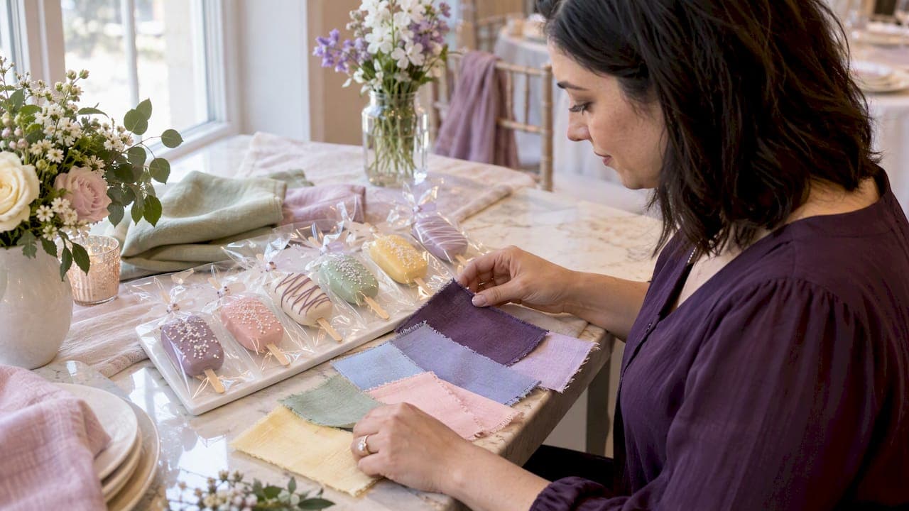
- Test under your actual venue lighting. Bring fabric swatches, a stationery proof and a florist sample to a walkthrough at the same time of day as your ceremony or reception, since warm venue lighting can shift a crisp white toward yellow or mute a bold jewel tone.
- Choose metallics with your photographer in mind. Champagne, bronze and rose gold tend to photograph warmer and richer than bright gold or silver, which is why mixed-metal styling has become the default recommendation in a lot of 2026 editorial work; bright metallics can also create glare under flash photography that softer tones avoid.
Pro Tip: Photograph your swatches side by side in the venue's actual lighting, then look at the photos on your phone later that evening; colours that seemed fine in person often reveal mismatches once you see them outside the room.
4. Palette examples mapped to wedding styles
The same list of colours can produce very different weddings depending on the style you're building toward; for cohesive event styling beyond colour, check out these wedding catering menu ideas. Matching your palette to a clear aesthetic, rather than picking colours and hoping a style emerges, makes every other decision easier.
- Quiet luxury: Commit fully to two or three colours, Mocha Mousse, Champagne and Warm Ivory is a natural fit, and spend the saved decision-making energy on fabric quality and restrained metallic details instead of adding more colours.
- Moody and jewel-toned: Deep Plum, Midnight Navy or Forest Green paired with candlelight and velvet linens reads as rich and dramatic; this style is best reserved for evening receptions, where the colours have the lighting to support them.
- Coastal and sun-washed: Dusty Blue and Soft White with sea-glass green accents suit linen table runners, glassware and natural shell details, and the palette holds up particularly well in bright, open-air venues.
- New rustic and terracotta-forward: Terracotta, Sage and Cream paired with dried grasses, natural wood chargers and unlacquered brass accents gives a grounded, textural look suited to barn or vineyard settings.
A good gut check: if you can picture your palette working at both the ceremony and the dessert table without feeling like two different events, you've likely found the right style match.
5. Checklist for testing swatches, proofs and florals before you commit
Before you place a single order, run every colour decision through a short physical test. It takes an afternoon and prevents the most common and expensive wedding colour mistake: ordering based on how something looked on a screen.
- Bring fabric swatches, a printed stationery proof and a florist sample to the venue itself, not just photos of them.
- Check each sample at the actual time of day you'll be photographed, since warm venue lighting and LED or candle sources can noticeably shift how a colour reads compared to daylight or a showroom.
- Photograph each sample with a timestamp, annotate the photo with the Pantone or supplier reference number, and share that record directly with your florist, stationer and planner so everyone is working from the same reference point.
The 60-30-10 distribution is the most commonly cited guideline for balancing wedding colour visually, splitting a palette across linens, florals and attire, then accents, so no single tone overwhelms a room. Vistaprint's planning guide recommends this ratio specifically because it keeps a bold accent colour from reading as overwhelming once it's scaled up to table size.
6. Using colour-matched small-batch favours to reinforce your palette
Dessert tables and favours are one of the easiest places to echo your palette without adding new decisions. Individually wrapped cake pops finished with hand-dipped coating, a simple drizzle, sugar crystals or ordinary sprinkles in your accent colour can tie a dessert table visually to your linens and florals through simple colour blocking rather than elaborate design work.
If you're considering this route, request colour swatches or a sample ahead of time, and build in a timeline that allows for sample approval before confirming your final order. Our wedding favours page walks through how that process works for couples who want their favours matched to a specific palette.

7. Palette combinations for cultural and regional wedding traditions
Many cultural wedding traditions carry colour expectations that work naturally alongside the 2026 trend palettes above. South Asian weddings often centre on red, gold and magenta, a combination that pairs comfortably with the saturated, jewel-tone direction already popular this year. Chinese wedding traditions typically favour red and gold for luck and celebration, which can be layered with warm neutrals like Champagne or Warm Ivory for a modern edit of a classic pairing. Greek and Mediterranean weddings frequently lean on blue and white, echoing the Dusty Blue + Soft White + Silver palette already trending for coastal-style 2026 weddings. Nigerian and other West African wedding traditions often incorporate vibrant aso-ebi fabrics in coordinated colours chosen by the families, a tradition that fits naturally with this year's shift toward bold, saturated accent colours rather than muted pastels.

In each case, the practical advice stays the same: treat the cultural colour requirement as your fixed starting point, the way you would a venue's carpet or drapery, and build the rest of the palette, neutrals, metallics and accents, around it rather than trying to force a trend palette to fit afterward.
8. London's Sweets: a colour-matching favour option
If your palette planning extends to the dessert table, we make handmade cake pops in our signature rounded-rectangle shape on a natural wood stick, finished and coloured to match your wedding palette.
- Finishes include Classic Drizzle, Celebration Sprinkles, Signature Mix and Custom Colour Theme, each individually wrapped for favours or a dessert table.
- Paid delivery may be requested within approximately 100 km of Dundas, Ontario, with exact address, availability, timing and fee confirmed before we accept the order.
- We review every request personally, so reach out early with your palette details and timeline.

To start, request a sample or a quote through our wedding favours page, and we'll confirm the details with you directly before anything is finalized.
FAQ
What is the Pantone colour of the year for 2026?
Pantone's 2026 Color of the Year is Cloud Dancer, an airy, soft off-white designed to work as a flexible base. It pairs easily with both soft pastels and bolder accent colours, which is why it shows up across several 2026 palette directions rather than just one style.
What are the most popular wedding colours for 2026?
2026 wedding colour trends favour saturated accent hues like cobalt blue, emerald, terracotta and electric magenta, typically paired with modern neutrals rather than used alone. Mocha Mousse and warm neutral combinations also remain popular as a quieter, enduring alternative.
What is the 60-30-10 rule for wedding colours?
The 60-30-10 rule is a practical way to balance a wedding palette: 60% of your colour goes to dominant elements like linens, 30% to florals and attire, and the remaining 10% to small accents like signage or candle holders. It keeps a bold accent colour from overwhelming the overall look once it's scaled up across a venue.
How do I choose wedding colours that match my venue?
Start by noting your venue's fixed colours, carpet, walls, chairs, and build your palette around them rather than against them. Bring fabric swatches, a stationery proof and a floral sample to the venue and check them under the actual lighting you'll be married and photographed in.
Can I match my wedding favours to my colour palette?
Yes. Favours like individually wrapped, colour-matched cake pops can echo your palette's accent colours through simple finishes like a drizzle, sugar crystals or colour blocking. Requesting a sample ahead of time lets you confirm the colour match before placing a full order.
Sources
- Your palette is showing: the bold, cozy and unexpected wedding colour trends of 2026
- Cloud Dancer wedding inspiration — Vineyard Bride
- Wedding colour palette ideas — Vistaprint CA
- 2026 wedding color palettes: 12 forecasted combos — Paperlust